Box with seven two-coloured woodcuts in red and black (five) and yellow and black (two) on BFK-Rives handmade paper
Dimensions: 86 x 76 cm each
Signature, inscriptions, markings: each signed and dated at lower right, numbered at lower left, one sheet titled additionally at the printing plate
Copy Number: 5/10
Printer: Peter Schleiss, Basel
Publisher: Maximilian Verlag, Munich
Donation: Karl Manfred Fischer
Accession Number: 1003438.1–7
Günther Förg's oeuvre encompasses a broad spectrum of painterly formulations on various image carriers. In his print works, Förg experiments with various techniques and materials. Without great effort, he can work serially, penetrate the depths of a problem, and yet remain on the surface, which alone is expressive, due to the speed of the process.1
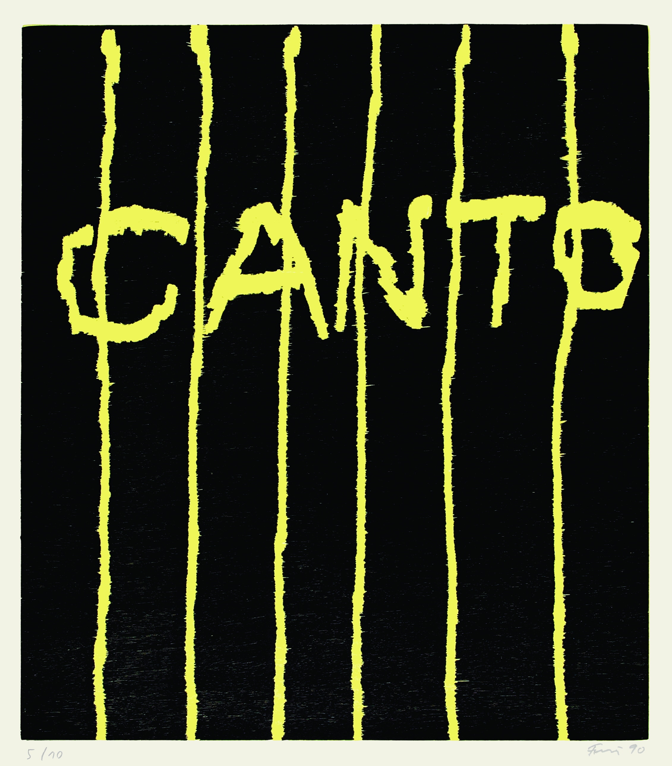
The Canto series probably originated in the painting Canto from 1989, which was followed by a series of other paintings with the same title. It is possible that Förg is recalling here the American poet Ezra Pound, who used quotations from the culture and history of Italy to epically express ideas and sentiments of his time in his major work - the Cantos (Songs). In 1945, the poet, who lived in Italy, was arrested and imprisoned in inhumane conditions in a cage specially made for death row inmates because of his relations with Mussolini. He escaped the death penalty only because he was declared insane. It was precisely during this time that a large part of his Cantos was created.2 Förg was particularly interested in this series of prints for their composition and overall effect in space.
The motif of the first woodcut is compositionally almost identical to the Canto picture of 1989, with vertical yellow stripes and the yellow lettering CANTO on a black background. With the knowledge of Pound's imprisonment, the viewer can understand this woodcut as a symbol for the poet in the iron cage.
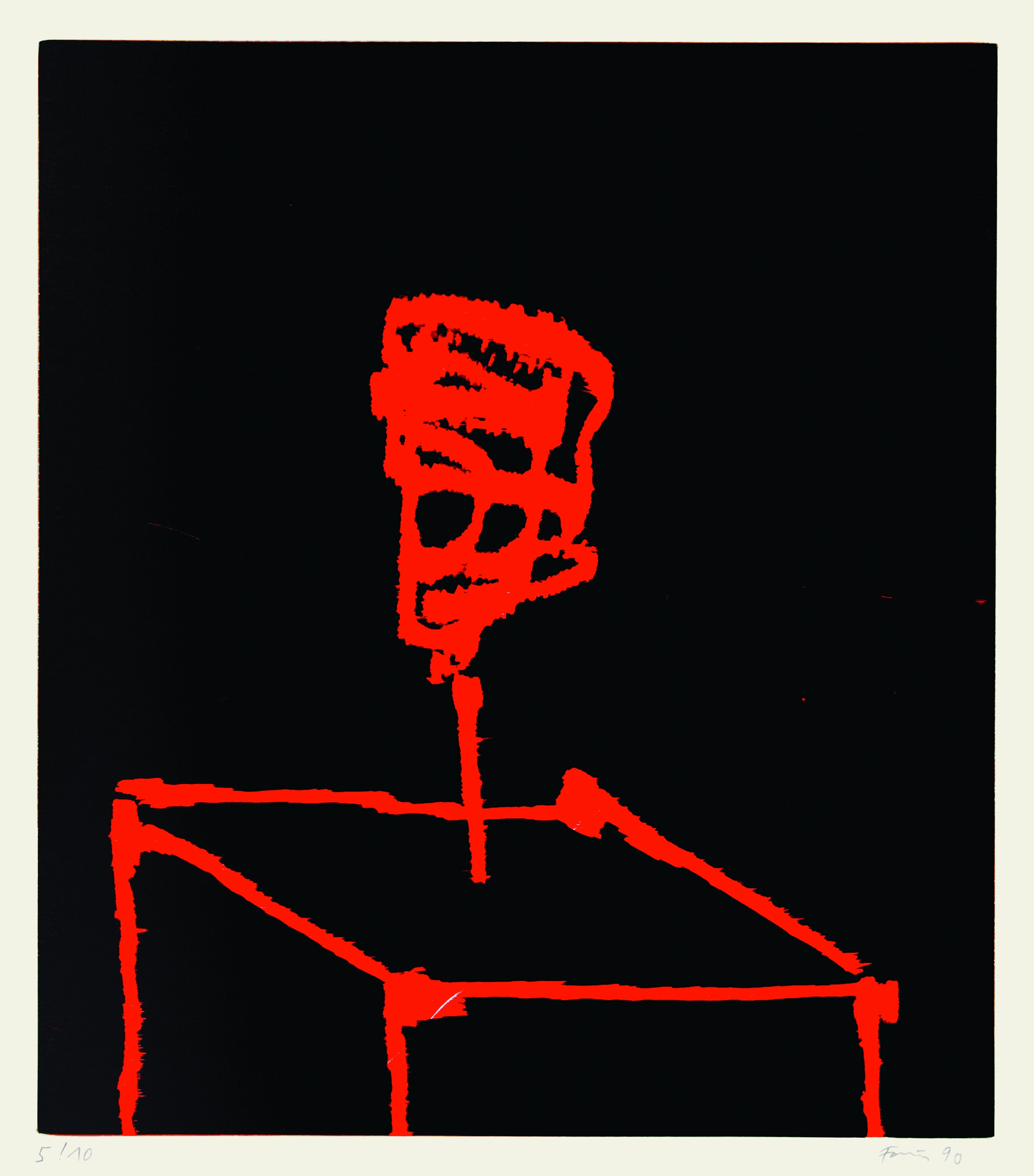
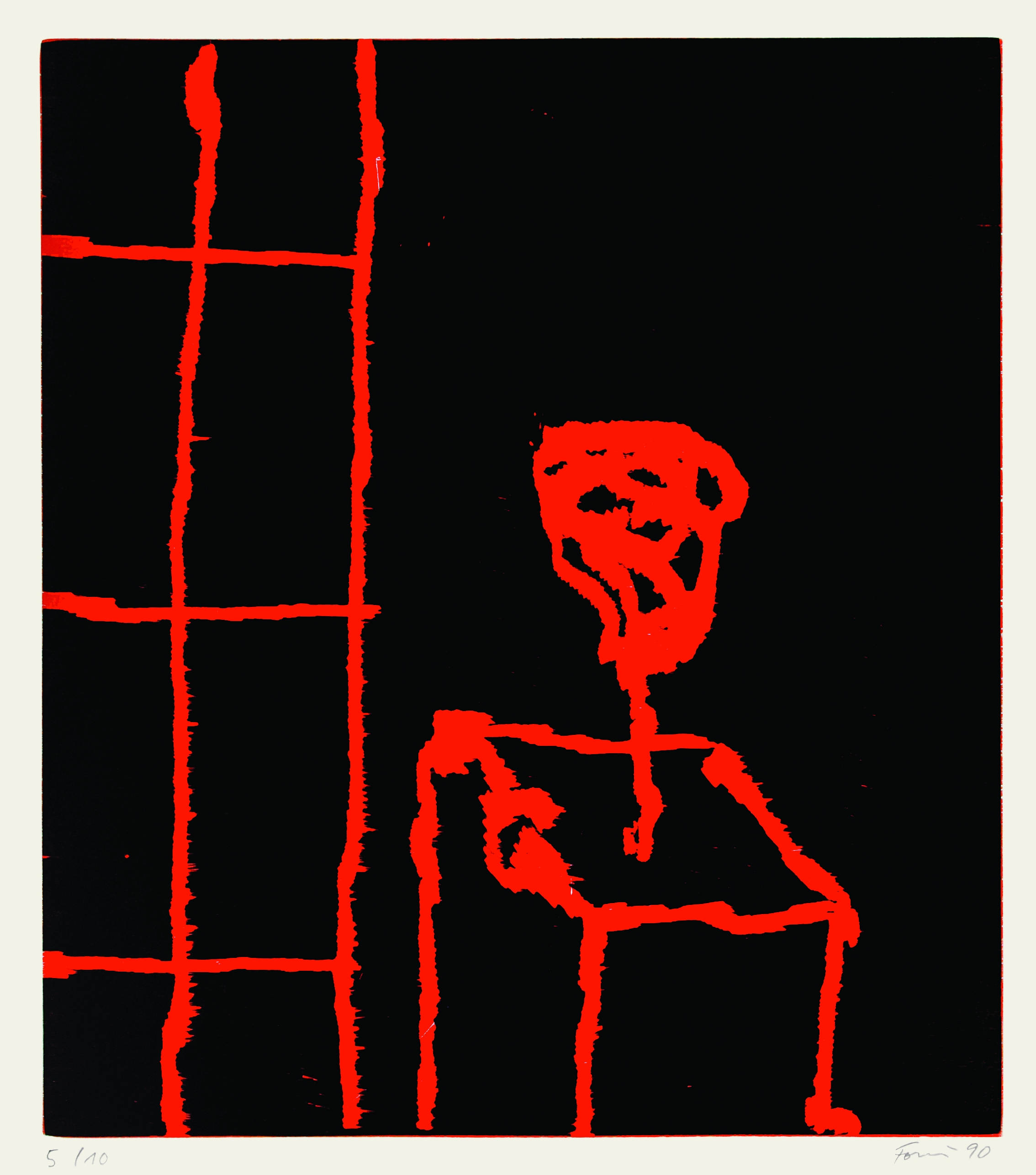
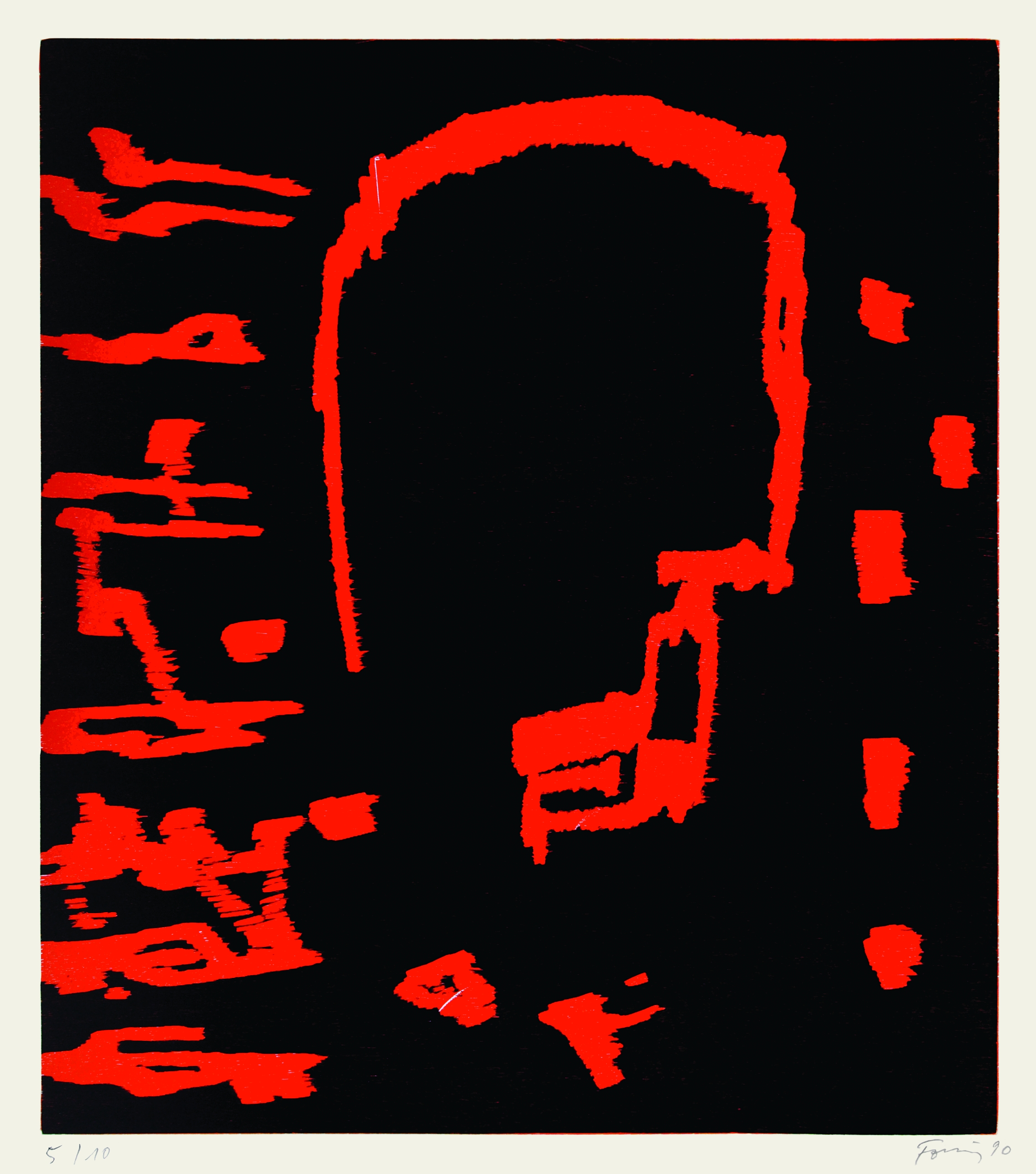
In the further representations the black background remains. In each case, the artist combines simple geometric constructions with various elements that allow figurative or representational associations. In the second woodcut, the lines are identifiable as the upper half of a slanted cube. The visible edges resemble a table. In the center is a shape that can be interpreted as a filled flower vase. The motif of the advanced table and the flower vase is repeated in two other sheets, but there it is juxtaposed with a grid formed by a few strokes. In another woodcut, an abstract head can be associated with the central form, surrounded by various signs similar to note heads and irregular, interwoven strokes. Perhaps references to a person's thought processes that elude control and foreign influence, suggesting a moment of freedom.
As an artistic strategy, Förg's free use of quotations can be compared to the perspective of a flâneur. He is not a constructor who reinvents everything in the sense of modernism. Rather, he gains his reflections from small observations and borrowings. In his work, despite an apparently abstract formal language, there are expressive moments with which he helps the abstract image to a new meaning. Förg takes up formal impulses of modernism, selects elements of abstraction as if from a historical construction kit, in order to give them a new task in the search for a dialogical reference, for example to literature.3
Sven Künzel
1 Max Wechsler, Günther Förg. Die Kunst des Tiefgangs an der Oberfläche, in: Kritisches Lexikon der Gegenwartskunst, ed. by Lothar Romain and Detlef Bluemler, Munich 1995, pp. 3-5.
2 Frederik Hetmann, Ezra Pound, Reinbek bei Hamburg 1992.
3 Cf. Siegfried Gohr, Wie Bilder sprechen. Zur Malerei von Günther Förg, in: Kat. der Ausst. Günther Förg. Make it new, Städtische Kunsthalle Recklinghausen, Bielefeld 2004.