Box with seven screenprints on cardboard
Dimensions: 80.4 x 80.3 cm each
Signature, inscriptions, markings: each signed and numbered at lower middle
Copy Number: 75/140
Printer: Atelier Silium, Paris
Editor and publisher: Éditions denise rené, Paris
Text: Max Imdahl
Accession Number: 1001083.1–7
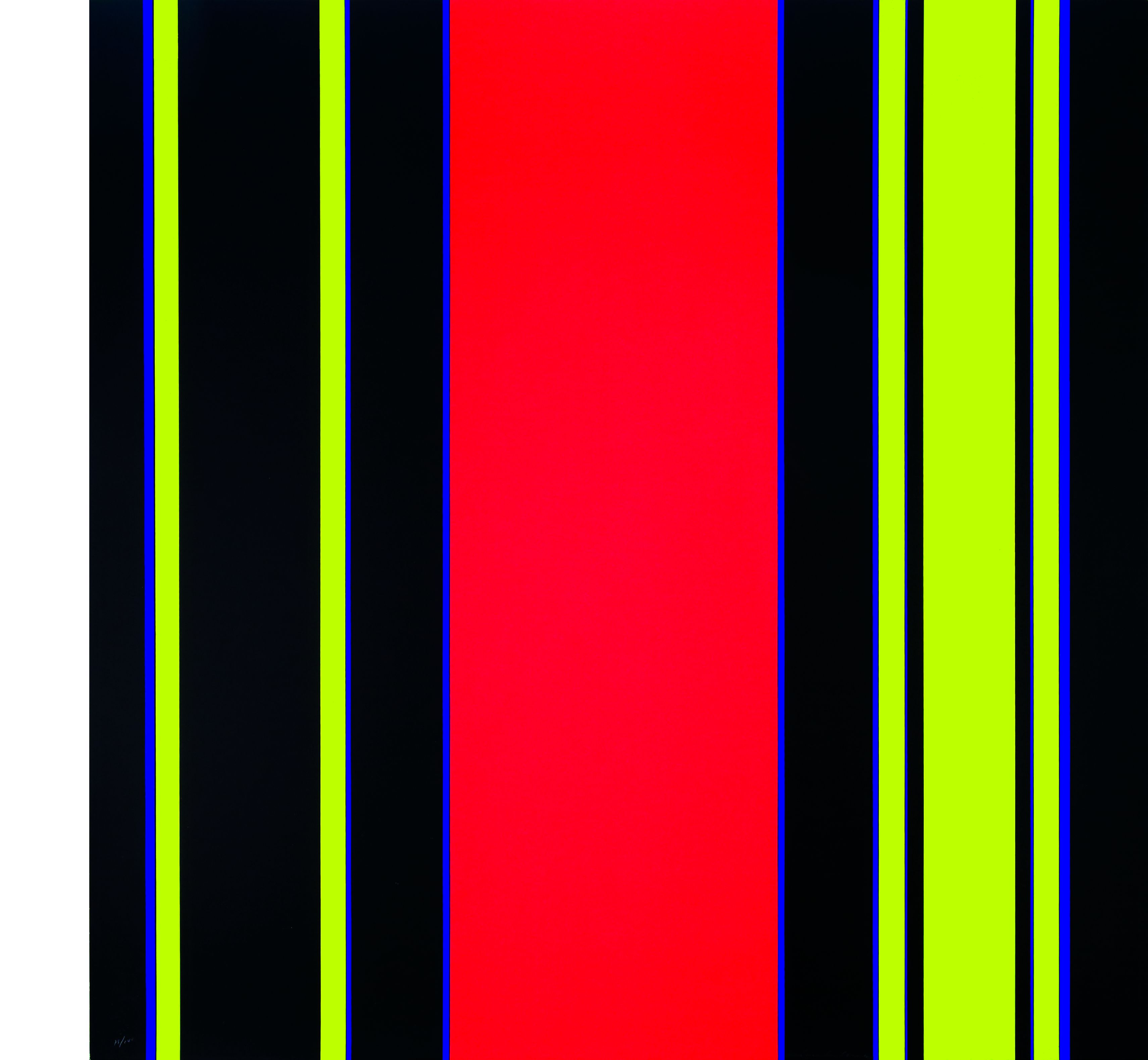
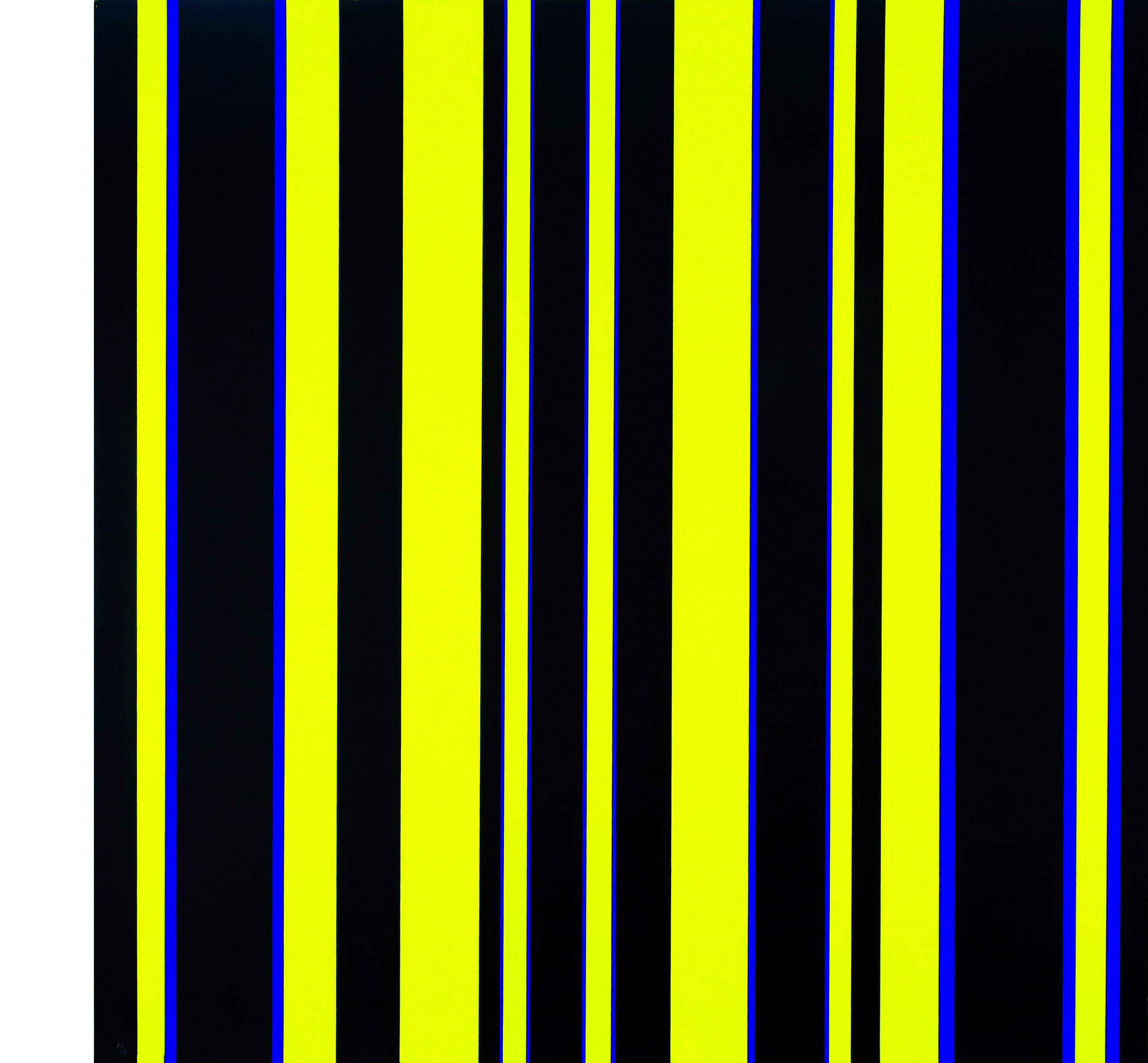
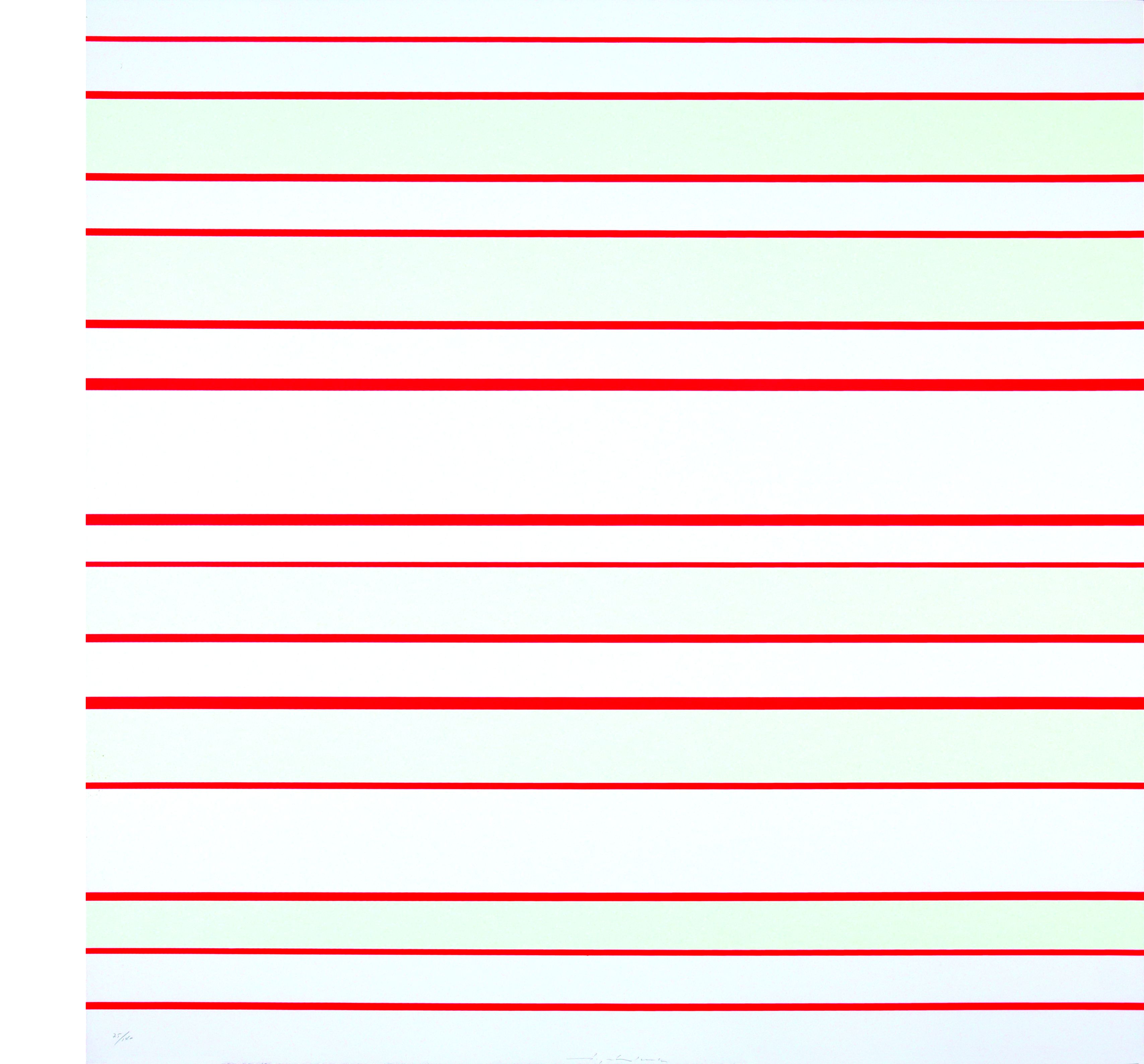
They may not be "beautiful", the colors in Günter Fruhtrunk's pictures. They were also not chosen according to taste preferences. Nevertheless, and precisely because of this, they activate the viewer to look beyond the usual horizon of his expectations.
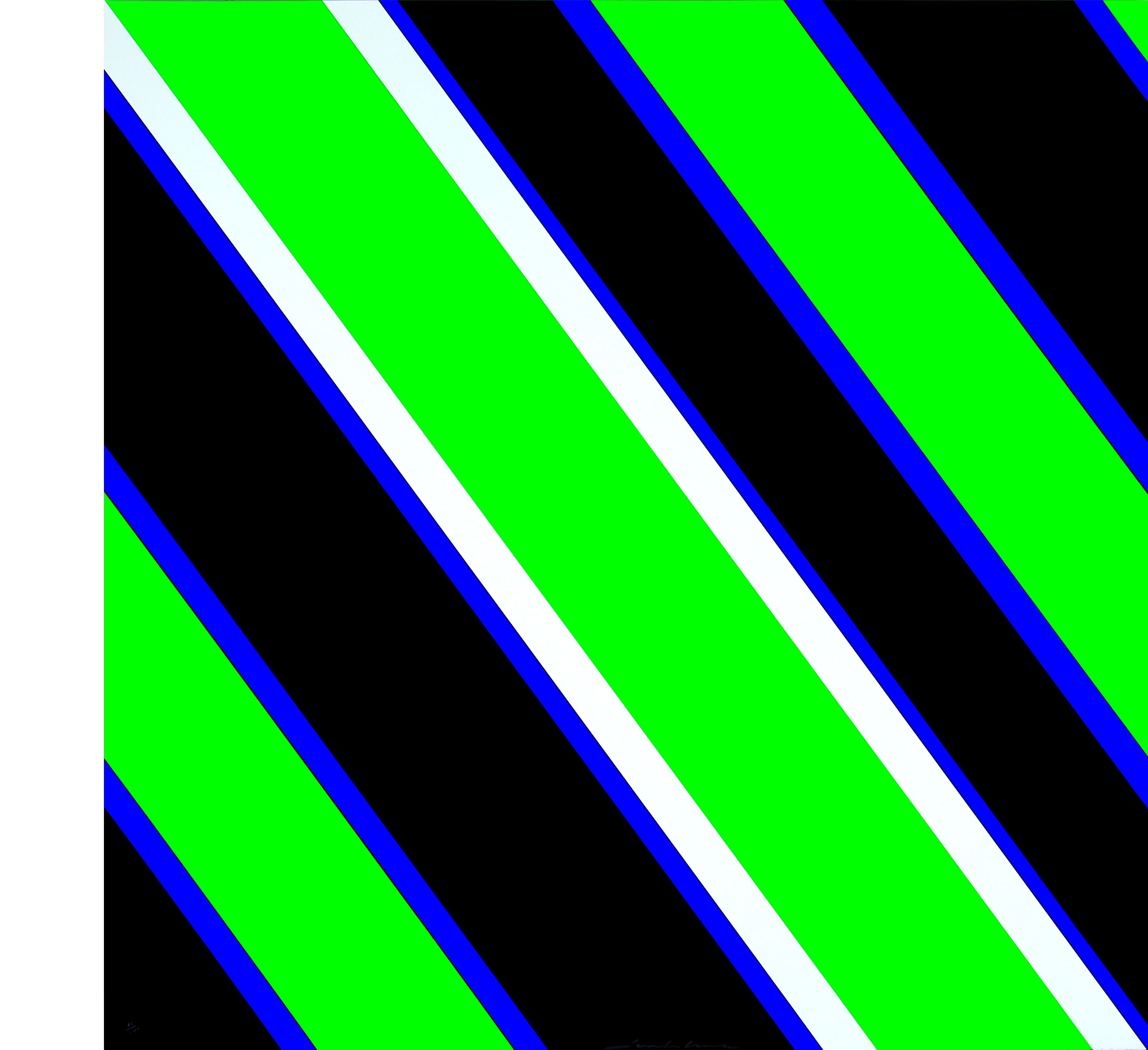
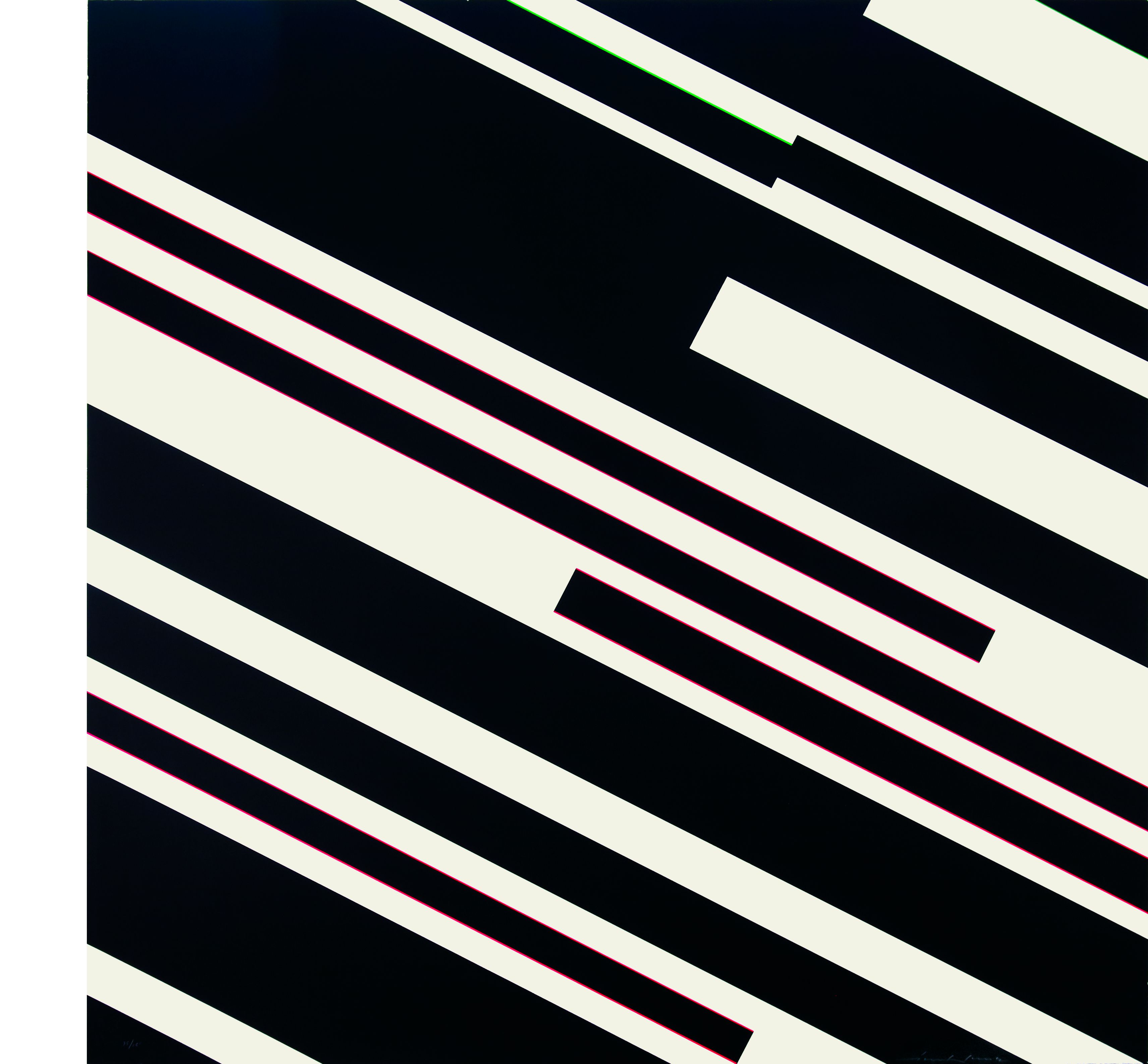
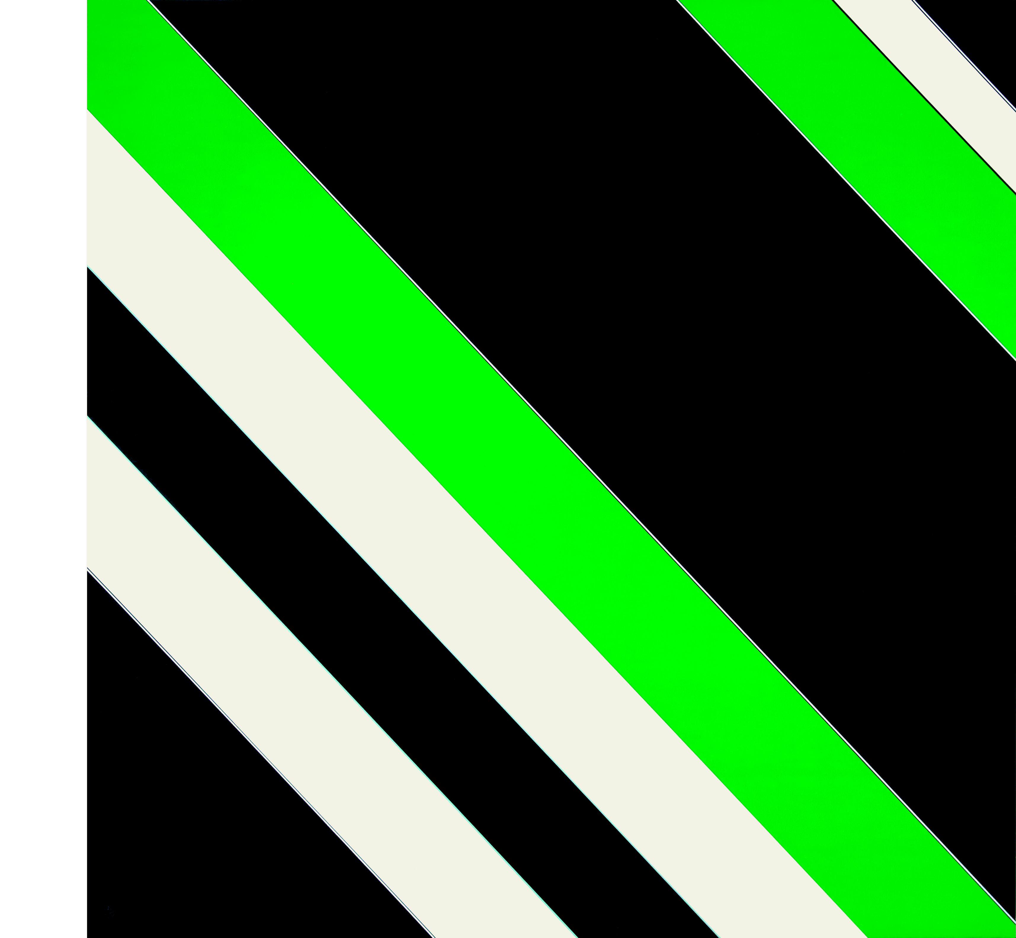
Black and white diagonal stripes are bordered by fine pink and green lines. The interplay of extreme color and quantity contrasts activates in the eye a seeing that goes beyond normal attention. The color lines interact, the sharp borders begin to flicker, causing the two-dimensional surface to vibrate. Nowhere in the painting does the eye find a resting place upon closer inspection. Everywhere there is movement, activity and energy. Oscillating dynamics, rhythm, destabilization of the pictorial space and, above all, optical irritation - these are the effects Fruhtrunk aims at with his paintings in a variety of concrete painting.
Of elementary importance are the figure/ground relationships of the color structures, which only become clear upon closer inspection. The black stripes are in direct congruence with the white ones. The viewer must become completely involved in the picture, immersed in the complex structure of superimposition, rhythmic sequence and system. In the process, "the superimposed can also always be the superimposed. Which system - black on white or white on black - has priority cannot be decided."1 Whether the viewer starts from the microstructure, i.e. approaches the picture, or from the macrostructure and keeps his distance - in both cases he is almost blinded by the force of the constant change of appearances. The images seem aggressive at times, as it remains a challenge to withstand the optical assault. Moreover, Fruhtrunk does not choose black and white by chance. They not only complement each other according to the principle of positive-negative contrast, they also contribute to the extreme luminosity of the complementary colors green and pink, only allowing their full development on paper and ultimately in the eye.
Max Imdahl writes in the portfolio text: "If dynamism is the content or message of Fruhtrunk's pictures, they do not depict their content, but initiate it as an event. It is an object of reflection in that it is not contemplated but accomplished." Thus, he is concerned not only with the beauty of what is seen, but with the vitality of seeing.
Melanie Bollmann
1 Ex. cat. Fruhtrunk, published by the Städtische Galerie im Lenbachhaus Munich 1973, p. 8.